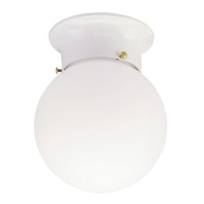
Hello Monday! I hope you all had a good weekend. Were you able to tackle any projects you’ve been wanting to work on? We had some friends over for dinner on Saturday, but Sunday we were able to work on one small bathroom spruce up project. Our kids’ rooms are attached by a Jack and Jill bathroom, and the light fixture in the shared toilet/shower room recently went out. So, it needed to be replaced. The existing fixture was one of those beautiful standard issue globe lights that probably came free with a four-pack of lightbulbs. You know the one. Looks a little like this…
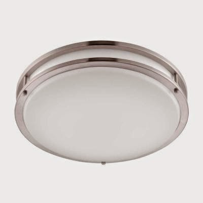
Stunning. So, we went to Home Depot and Lowes to find a replacement and came home with a round flush mount light similar to this one.
The only problem was, when we went to install it, the air conditioning vent was literally about 3″ away from the light box. So this light would have covered about half of the air vent. Dammit! This is the kind of thing measuring tapes can prevent.
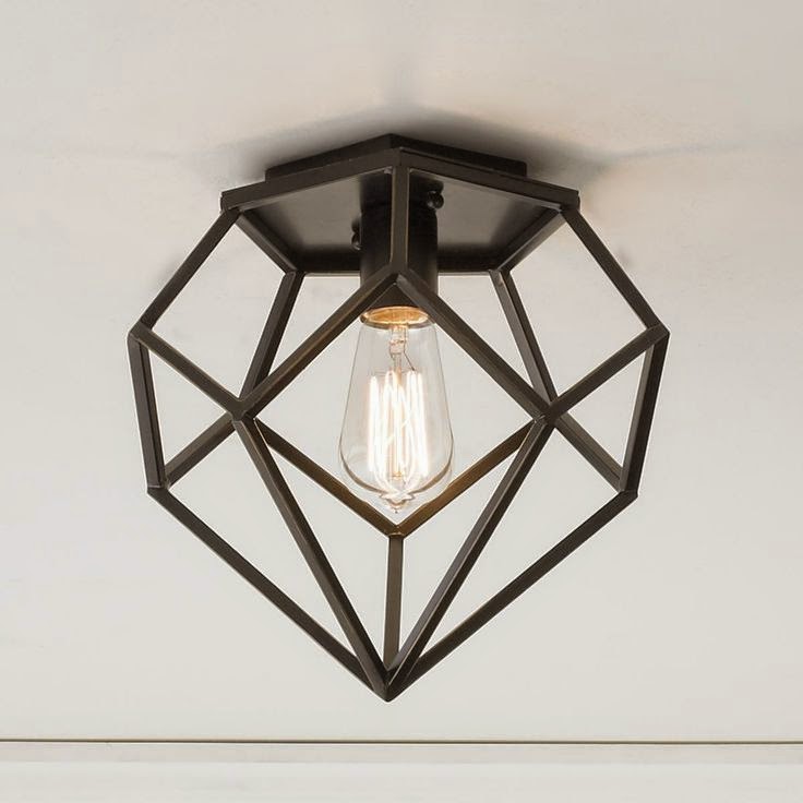
Well, back to Home Depot to look for something else that would work for the really small space available, but nothing bowled us over. I was thinking a semi flush mount would work, but they all hung too low and would knock into the shower curtain rod. So to the interwebs I went. This one from the Young House Love collection on Shades of Light grabbed my eyeballs.
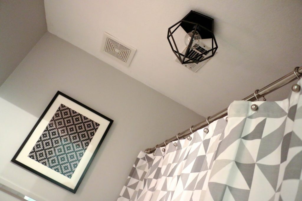
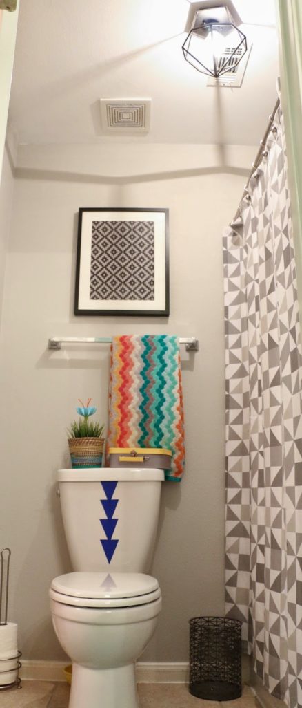
I loved the geometric shape and how it tied into the gray triangle shower curtain I already had in the space. What’s nice is it’s not a complete flush mount and the part that attaches to the ceiling is very small and works perfect. We put it up the day it came in because that bathroom had been without a light for like a week. No one likes to do their business in the dark:(
Once the light was up, I painted and added a few little décor items to coordinate. I decided to take further the geometric look of the light and shower curtain.
When we moved in, the walls were an ugly shade of mustard yellow (is there a good shade of mustard?) and the ceiling (along with every ceiling in the house) was painted a dark beige color. I’m very much a cool color person and these were just not working for me. For the walls, some gray paint in Valspar Filtered Shade in eggshell that I had left over from Parker’s room. For the ceiling, Valspar Ultra Pure White in Flat.
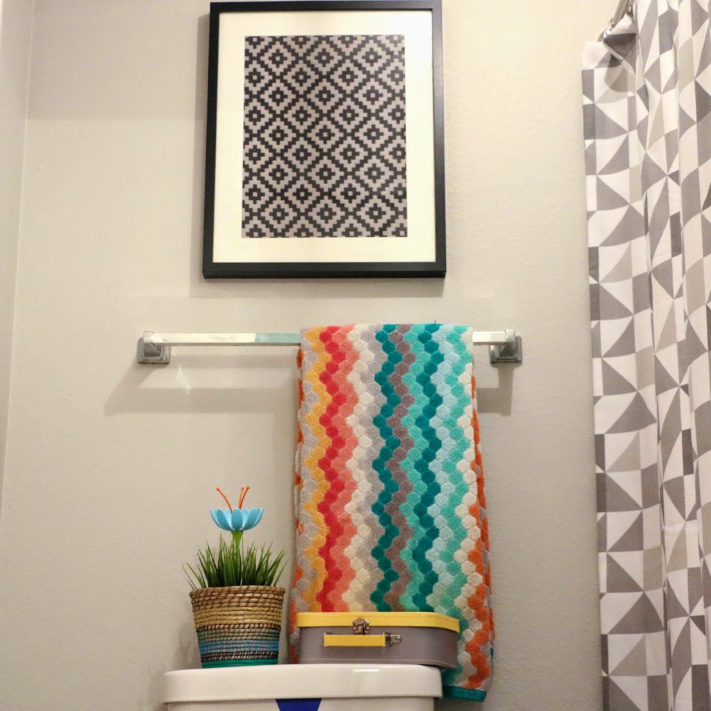
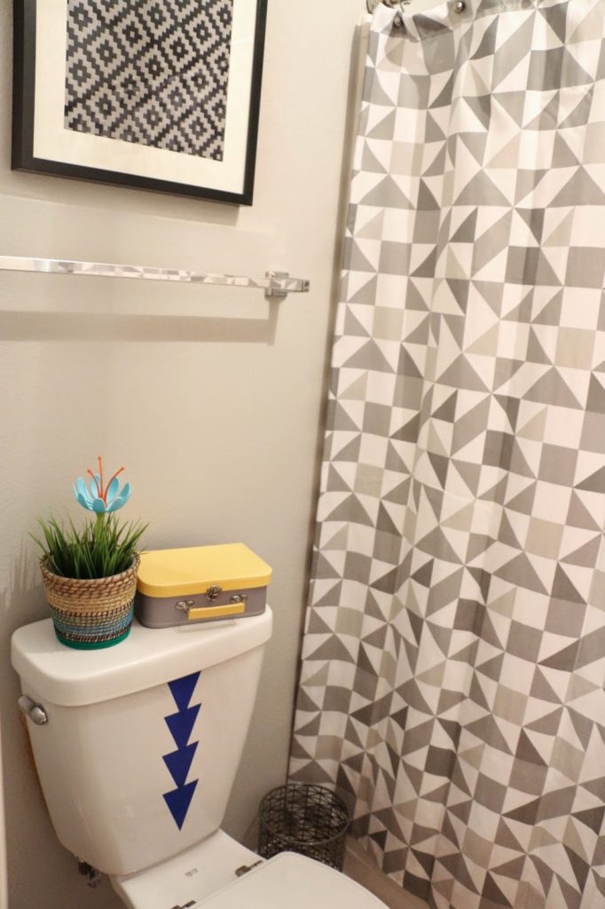
I framed some diamond fabric from Joann fabrics and added a little paper suitcase from Target, a wicker pot with faux grass from Ikea, and a Boon flower (it’s meant to be part of a drying rack for bottles and pacifiers, but it’s really fun for this kid’s space). The towel is from Target and has little hexagon shapes.
The last thing I added were triangle decals left over (can you tell I made a lot of these triangles?) to the back of the toilet. Brandon (my husband) joked that it looked like a big arrow pointing to where the kids should “do their business”, but I think it’s a fun splash of color and print to an otherwise plain toilet. The trash can is gray with a crosshatch look, tying into the geometric theme of the room.
Unfortunately, I don’t have a before pic of this space. Just imagine deli-mustard yellow closing in on you from all sides, and you’ll have an idea.
