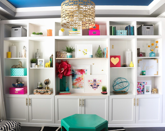
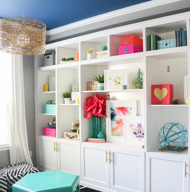
I’m not sure if I’ve mentioned this before (ha!), but one of my favorite DIY projects in our new house is our wall of built-in bookshelves. I love the view from my office of all the arrangements, and one of my favorite pastimes is shuffling them to create a completely new look.
Recently, Minted took notice of all my different ‘shelfie’ (or shelf styling if you want to be technical) posts and photos and contacted me to see if I wanted to work with them. Really?! I couldn’t believe it! I love their perfectly curated collections of unique art, stationery, and home décor from independent artists and was thrilled at the chance to work with them.
I decided while it would be easy to create a gallery wall (gallery walls 4 life yo!), it would be more fun to use some of the art from Minted to style my built-ins and demonstrate how you can use large pieces of art in your built-ins or bookshelves.
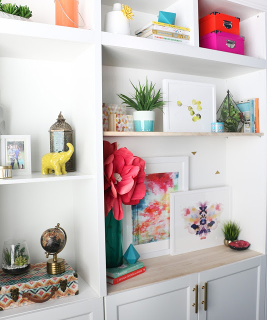
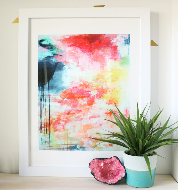
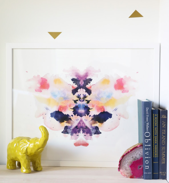
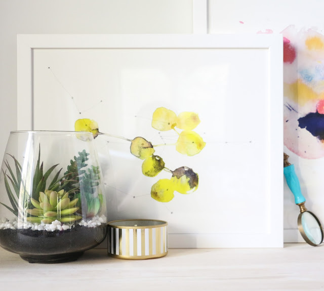
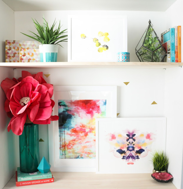 The first step was selecting pieces I thought best matched my current style, which was no easy task! Minted has so many awesome pieces, that it’s really difficult to choose! Did you know that they host contests among independent artists to to choose their collections? I ended up picking three pieces that were very colorful, had abstract and geometric qualities, and complimented each other. The largest one was by Amira Rahim and titled ‘Girls in Brooklyn’. I have been a huge fan of Amira for quite a while and am so happy to finally have one of her prints. The next one I selected was titled ‘Watercolor Inkblot 1’ by Kristen Smith. I love this fanciful take on the ink blot and who could say no to watercolor?! The final piece I selected was the yellow geometric print by Kelly Ventura titled ‘Connection No. 2’ which I felt went well with the abstract nature of the two other prints and tied into the yellow in both of those as well.
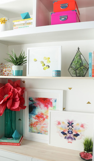
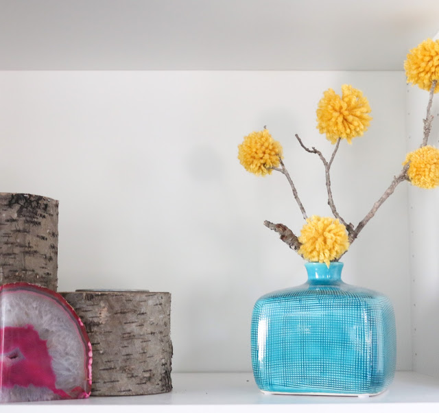
The first thing I like to do when accessorizing is try to mimic the feel and colors of the piece . I also love to add varying depths and heights to really fill the space. A little greenery doesn’t hurt either. As you can see, I used items that were both pink and blue to draw on some of the colors in the art. I also added a little height with the large pink crepe paper flowers. A few design books and printed items (like the wood boxes and candle), and the shelves were starting to come together.
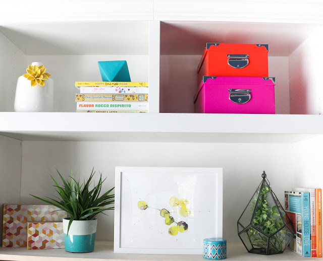
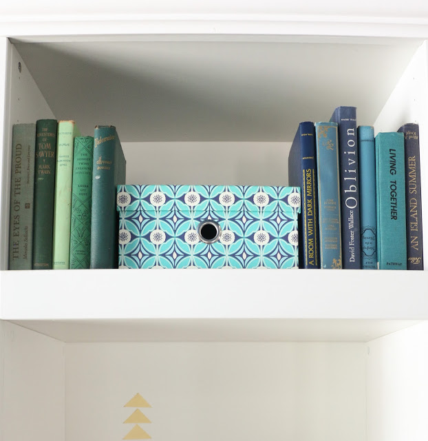
I filled the rest of the shelves with other colorful decor items like boxes, more books, vases, and trinkets, all of which echoed the color palettes of the pieces.
I love how they turned out! I think I may keep them like this from now on (well, with the exception of holidays, when they WILL get tricked out on theme).
I’ve always had art in my shelf layouts, but never tried such large pieces before. I think it may be my favorite new technique. You can use just one piece of art for a dramatic, focused look, or combine them with accessories for a more layered look. Just a few simple decorations tying into the colors/theme of the art can bring it to life and add dimension. Take for instance the print below: a simple plant and geode, and the shelf feels more fleshed out and alive.
For the two pieces above, I used accessories on both sides to coordinate with the colors of the artwork. Nothing to it!
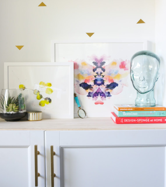
Another approach, is to style based on the shape of the art itself. These two pieces have a very modern psychiatric/Rorschach look to them, so I paired them with my glass head and magnifying glass to play on that aspect.
However you decide to style your shelves, I recommend trying out a few larger pieces of art. Play around with the arrangements, and you’ll be surprised how well they fit in and the added variation it gives. If I’ve learned anything, it’s that art is for more than just your walls!
(adsbygoogle = window.adsbygoogle || []).push({});
October 18th, 2015 at 2:33 pm
HI- these look great. I want to know more specifics about the wire pendant on your lamp- did you DYI that or buy it?
October 19th, 2015 at 2:29 am
Hi lomagirl! That light fixture is actually from shadesoflight.com. It is from their young house love collection.